library(magrittr) #pipes
library(ggplot2) #ploting
library(dplyr)
library(tidyr)Todays post is a lesson in Facets, as well as humility. The task this week was to replicate the graph in Chapter 8 of Tableau for Healthcare in R. The graph in question is called a Table Lens (This is the name the book uses, however I did have trouble finding this name in Google searches), it is a collection of charts with a common theme, this time looking at countries in various WHO regions and some statistics associated with mortality as well as health expenditure. I say this is a lesson in humiltiy as I have read through the excellent book R for Data Science, and yet the idea of faceting a ggplot graph slipped my mind. This ended with hours of trying to find a package in R to line up graphs, and way more time then I care to admit spent on getting things prefect. I did find such a package called cowplots, which can be found here. While this is an excellent package, its use was unecessary and I reverted back to using the excellent facet feature of GGplot, which can be seen below! 
Load Libraries
Import Data
ds <- readxl::read_xlsx(path = "../2020-01-04_my-start-to-r/Tableau 10 Training Practice Data.xlsx"
                        ,sheet = "03 - WHO Life Expect & Mort"
                        )
Clean Names and Transform
varnames <-  c("who_region", "country", "year" , "sex" , "life_expect_birth" , "neo_mort"
               ,"under_five_mort" , "health_expenditure")
names(ds) <- varnames

# Order Countries based on Life Expectancy at Birth

ds$country <- factor(ds$country, levels = ds$country[order(ds$life_expect_birth)])

#To "Long" Form

ds1 <-  ds %>% pivot_longer(5:8)#select columns 5 throuh 8, leave new columns at default names

# Set up labels for Facet, as well as function for Facet Labeller

facet_labels <-  list(
"life_expect_birth"   = "Life Expectancy at Birth "
,"neo_mort"           = "Neonatal Mortality Rate"
,"under_five_mort"    = "Under-Five Mortality Rate"
,"health_expenditure" = "Health Expenditure per Capita (US$)"  )

variable_labeller <- function(variable,value){
  return(facet_labels[value])
}
Graphs
hightlight_countries <- (c("Mauritania", "South Africa"))

g1 <-  ds1 %>% filter(who_region == "Africa") %>%
  mutate(name = factor(name, levels = c("life_expect_birth" , "neo_mort"
               ,"under_five_mort" , "health_expenditure"))
         ,highlight = country %in% hightlight_countries) %>%
  ggplot(aes(x = country, y = value, fill = highlight)) +
  geom_col(show.legend = FALSE) +
  coord_flip() +
  labs(
    title = "World Bank Life Expectancy, Neonatal & Under-Five Mortality Rates, and Health Expenditure Analysis"
    ,x  = NULL
    ,y = NULL
  ) +
  facet_grid(~name, scales = "free_x",labeller = variable_labeller) +
  theme_bw() +
  geom_text(aes(label = round(value, 0)), hjust = 0) +
  scale_y_continuous(expand = expand_scale(mult = c(0,0.2))) +
  scale_fill_manual(values = c("TRUE" = "#fc8d59", "FALSE" = "#2b83ba"))
g1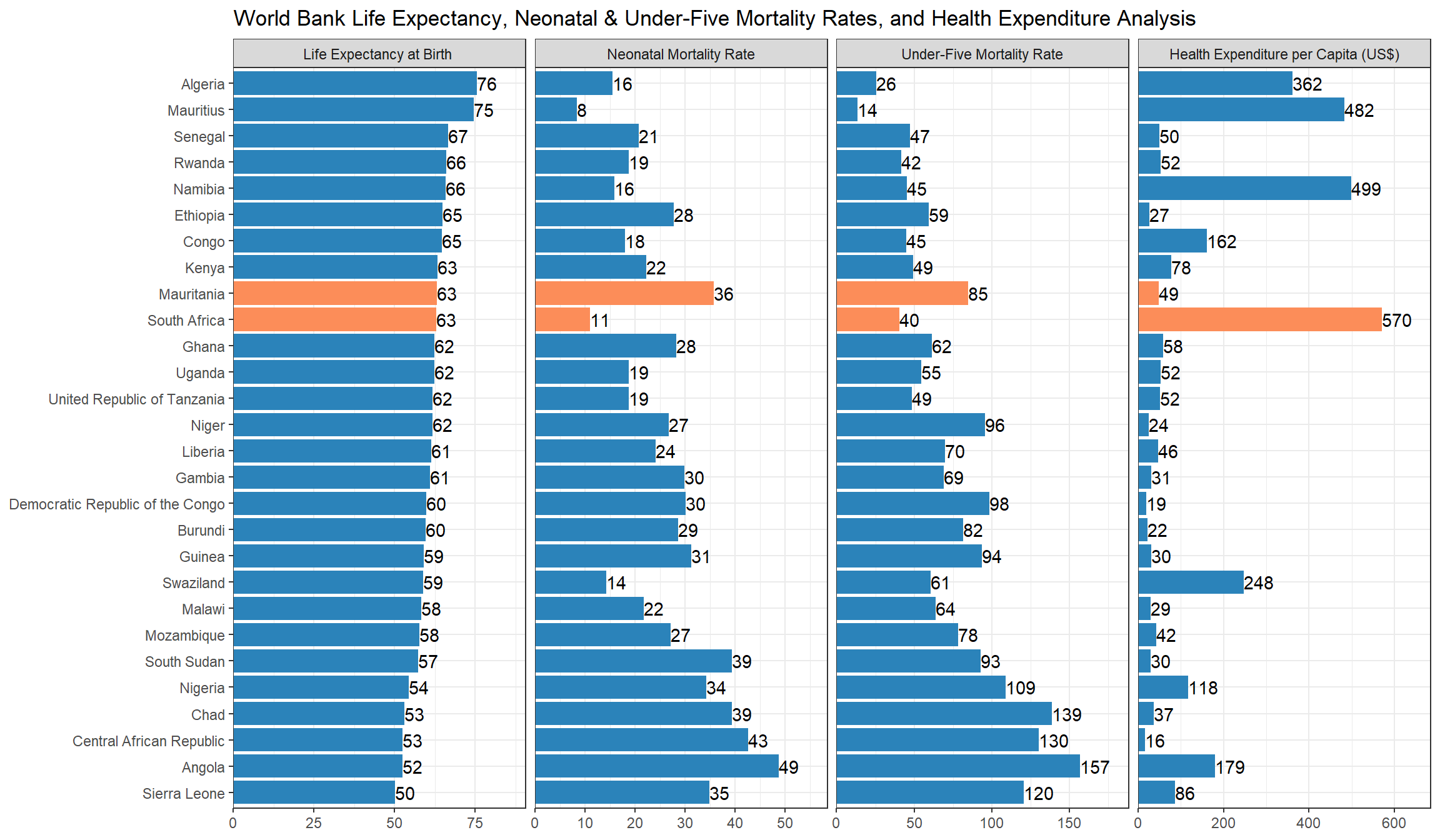
Reuse
Citation
BibTeX citation:
@online{belanger2020,
  author = {Belanger, Kyle},
  title = {Facets and a {Lesson} in {Humility}},
  date = {2020-01-29},
  langid = {en}
}
For attribution, please cite this work as:
Belanger, Kyle. 2020. “Facets and a Lesson in Humility.”
January 29, 2020.