library(tidyr)
library(magrittr)
library(ggplot2)
library(stringr)
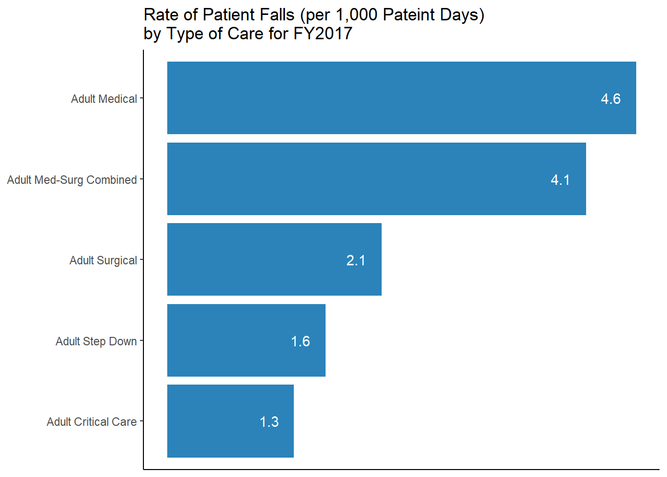
library(dplyr)Today starts my attempt at sharing my R journey with the world! I have been learning R off and on now since late 2019, I have begun to take it much more serious as I work through my Data Analytics class at UCF. My love for all things numbers and graphs has really blossomed, and I am choosing to share that love with anyone who cares to read. I will not claim to be the best at R, or any programming for that matter, but these are my attempts. Each post in this serious will be replicated a graph created in Tableau from the book Tableau for Healthcare. Todays graph is a simple horizontal bar chart, in transferring to both a new blog site and computer I have unfortunately lost the original bar graph, but trust me the one I created looks just like it.
Load Libraries
Import Data
ds <- readxl::read_excel(
    path   = "Tableau 10 Training Practice Data.xlsx"
    ,sheet = "02 - Patient Falls-Single Hosp"
    )
Clean Data Names
#should make reusable forumla at later time
names(ds) <- tolower(names(ds))
names(ds) <- str_replace_all(names(ds)," ", "_")
Convert Data to ‘Long Form’
ds1 <- ds %>%
  gather("patient_falls_no_injury_rate" , "patient_falls_with_injury_rate"
         ,key   = "injury"
         ,value = "rate" ) %>%
  mutate(injury = (injury == "patient_falls_with_injury_rate"))
Graph 5.1
b1 <- ds %>%
  ggplot(mapping = aes(x = reorder(type_of_care,total_patient_falls_rate ) , y = total_patient_falls_rate)) +
  geom_col(fill = "#2b83ba") +
  coord_flip() +
  scale_y_continuous(breaks = NULL) +
  theme(axis.ticks = element_blank()) +
  labs(title = "Rate of Patient Falls (per 1,000 Pateint Days)\nby Type of Care for FY2017"
      ,x     = NULL
      ,y     = NULL
      ) +
  theme_classic() +
  geom_text(aes(label = format(total_patient_falls_rate, digits = 2)), nudge_y = -.25, color = "white")

b1
Reuse
Citation
@online{belanger2020,
  author = {Belanger, Kyle},
  title = {My {Start} to {R}},
  date = {2020-01-24},
  langid = {en}
}